
HOLTY’S BLOG: AHL LOGO RANKINGS
Everyone loves pictures right? If you haven’t been following along The Hockey News is currently ranking all 30 AHL logos. They’re doing one logo a day and so far have Albany (30), Syracuse (29), and Providence (28).
I could reveal one logo a blog too and be here all season, but I’m impatient and as I’ll remind you it’s my blog and I’ll do what I want…
Now for the blog…
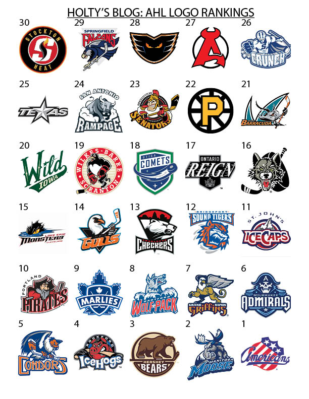
The Americans simply have a timeless logo that has mass appeal. It was actually selected by each of the three members of the communications office independently. I do like The Hockey News criteria of “teams having their own identity and not just ripping off the NHL team,” though they’re more strict on that it would appear.
Random thoughts:
– Charlotte has a sneaky good logo
– San Jose would be better if it didn’t have the corporate logo behind it.
– Lehigh Valley has a cool name and could do more with the logo; same for Wilkes-Barre/Scranton.
– I loved Milwaukee’s old logo. Their new one is just as good. Grand Rapids is changing theirs next week.
– Ontario’s new logo is good. But, it’s not as good as their old logo.
– Stockton … well …
– Chicago should ditch the stick and puck. (Sidenote: I thought that was a tire for the longest time)
– Springfield could be GREAT with an updated logo since they have a great name.
– Hartford was the biggest point of contention when I showed friend of the blog @KevinBartl. He doesn’t like it. I like the logo and I like the hidden meaning behind the name, which I think you have to factor in when looking and talking about logos.
– I know it’s different on jerseys, but Portland should just get rid of the city name hanging off the left edge.
How did I do? Let me know what you think by tweeting to me @CondorsHolty or shoot me an e-mail rholt@bakersfieldcondors.com.
Until next time #Condorstown…