
HOLTY’S BLOG: DEFUNCT HOCKEY LOGOS
So far this summer, everything in Condorstown has been new. NEW General Manager, NEW Head Coach, NEW Assistant Coach, NEW Affiliation, NEW hockey offices, NEW Jerseys, and most recently, NEW website (tip of the cap to Jason Best and iSportsMedia by the way, they rock).
There’s even been a NEW highway in Bakersfield this summer. But, for today’s blog, I’m kicking it OLD school. Much like I still drive on Truxtun, today is about reliving the past. Thanks to good friend of the blog @mKem44, I’m taking a look at the four best minor hockey league team logos. These aren’t current teams since that would be easy. (ECHL – Condors, AHL – Grand Rapids, NHL – Philadelphia)
There are only four defunct-team logos, because friend of the blog @WillHoenike hates things that come in fives. I figured that I would reduce his stress level. These are strictly based on the logo and not the team name (which I already blogged about: click here) They are ranked, from 4th to 1st, top to bottom, because, as I’ll remind you, it’s my blog, and I’ll do what I want…
#4: CORNWALL ACES (AHL 93-95) – I have a confession Condorstown. Alaska’s pre-game jerseys this past season featured four![]() ace playing cards across the chest and I thought they were awesome. The Cornwall Aces played out of Ontario and were the AHL affiliate of the Quebec Nordqiues. I like playing cards, and I like this logo. Can’t “break it apart” too easy as @KevinBartl would say, but it’s cool.
ace playing cards across the chest and I thought they were awesome. The Cornwall Aces played out of Ontario and were the AHL affiliate of the Quebec Nordqiues. I like playing cards, and I like this logo. Can’t “break it apart” too easy as @KevinBartl would say, but it’s cool.
#3: PEE DEE PRIDE (ECHL 97-05) – Listen, the name is turrrrribbbleeeee, but I’m a fan of the logo. The hockey  puck inside the P says “hey we’re a hockey team, but we’re not going to go out of our way to show it.” Plus, I can’t tell if the lion is growling or laughing, but there’s a lot you can do with the logo.
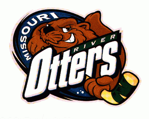 #2: MISSOURI RIVER OTTERS (UHL 99-06) – To me, this logo boils down to the actual otter. He (or she I suppose) is setting the tone for the organization. He looks like a shady fella that might just two hand you across the back of the legs. I would have changed the name to Otters so as not to exclude the Sea and European versions, but to each his own.
#1 JOHNSTOWN CHIEFS (ECHL 88-10) – Nobody ownzzzzz them anymore, but for me, this is still a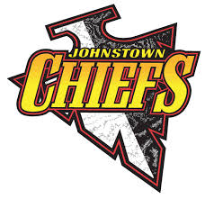 great logo and tough to beat. The arrowhead is fierce and nothing about the logo screams hockey, but it became synonymous with the game. Minor league hockey logos are notorious for incorporating the sport in the logo whether overtly (Condor holding a stick) or subtly (Everblades logo is a skate), so I enjoy a logo that does not need hockey in it. The Chiefs never won anything, so why not let them have the best logo?
What is your favorite defunct logo? Tweet or email them to me! Until next time Condorstown…
Ryan Holt a.k.a. Holty, is the voice of the Condors and recently wrapped up year two in Condorstown. He’s coming down with a cold. Have a #HoltysBlog idea? Follow him on Twitter @BroadcastHolt or shoot him an email with ideas to rholt@bakersfieldcondors.com