
HOLTY’S BLOG: ECHL JERSEY POWER RANKINGS
Friends. Recently, the great website, Uni-Watch, unveiled their jersey power rankings for each of the four major sports and then a comprehensive list of all 122 major professional teams. (Click here to see the list) Congrats to Edmonton, who changed nothing, and still moved from 26 to 14 in the NHL and up to 60 from 104 in the overall rankings. If you think that Columbus, new Dallas, and Florida have better jerseys than the classic Oilers sweaters, then stop reading this blog.
I decided that the ECHL should have jersey rankings too. All 22 teams listed in order from worst to best. It is based on my personal opinion, because after all, there are people out there who will say that team No. 22 has the BEST jerseys. Those people are wrong, but they are certainly entitled to their opinion.
My criteria is simply what I like or appeals to me from an on-ice and fan perspective. I do not like numbers on the front of the jersey, bad logos that ruin the entire jersey, and although I have bent quite a bit on this as you will see, I do not particularly like the diagonal word across the jersey look. What I do like is teams that have three good jerseys, because we are not the NHL and do not need to have traditional, “classic,” sweaters. I like clean looks, logos that don’t scream ‘hey we’re a hockey team,’ and good color schemes that go well together.
So without further ado, here is the definitive list with a quick comment on all and a link to their best or worst jersey. They are broken down into three sets, because when I took on this task, I made “good,” “OK,” and “needs work,” piles just off first impression. One team from each category will have a picture in the blog, because as I’ll remind you, it’s my blog, and I’ll do what I want…
THE NEEDS WORK DIVISION
22) Las Vegas Wranglers – Santa Claus is coming to town. Needs black pants and better logo.
21) Elmira Jackals – Numbers on the front, red helmets, two same jerseys, and bad logo. (click here)
20) Evansville Icemen – I don’t know what’s going on with the logo or the shoulder pinstripes. (click here)
19) San Francisco Bulls – Party like it’s 1999. Stars v. Sabres style. (click here)
18) Colorado Eagles – The Kings want their jerseys back. Love their thirds though. (click here)
17) Kalamazoo Wings – I like the logo and the colors, but not the shoulder patches or sock style. (click here)
THE OK DIVISION
16) Fort Wayne Komets – The all-orange jersey is too much. (See Evansville’s picture)
15) Stockton Thunder – I like black and gold, but still hate those guys. (not linking their jerseys, deal with it)
14) Wheeling Nailers – They would be higher with their old jerseys that had red in them. (click here)
13) Reading Royals – Love the whites, the other two are yikes. (click here)
12) Ontario Reign – Very busy jerseys, but a great logo. (click here)
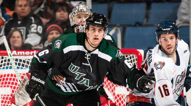
11) Utah Grizzlies – I like the colors, but I do not like their third jersey. @KevinBartl loves it.
THE GOOD DIVISION
10) Cincinnati Cyclones – The whites are cool and different with the team name on back. (click here)
9) Greenville Road Warriors – Clean, crisp jerseys. Affiliate thirds are cool too. (click here)
8) Florida Everblades – Huge fan of the color scheme and the waist design. Not of the front numbers. (click here)
7) Idaho Steelheads – I did not know Boise was the “City of Trees” until I saw these jerseys. Educational! Blacks are great, but I like the old blues they wore as well. (click here)
6) South Carolina Stingrays – Colors are great. Jerseys have a good look. Ditch the red “Stingrays” one. (click here)
5) Alaska Aces – Glacier blue third jersey is the only one I like with the diagonal writing. (click here)
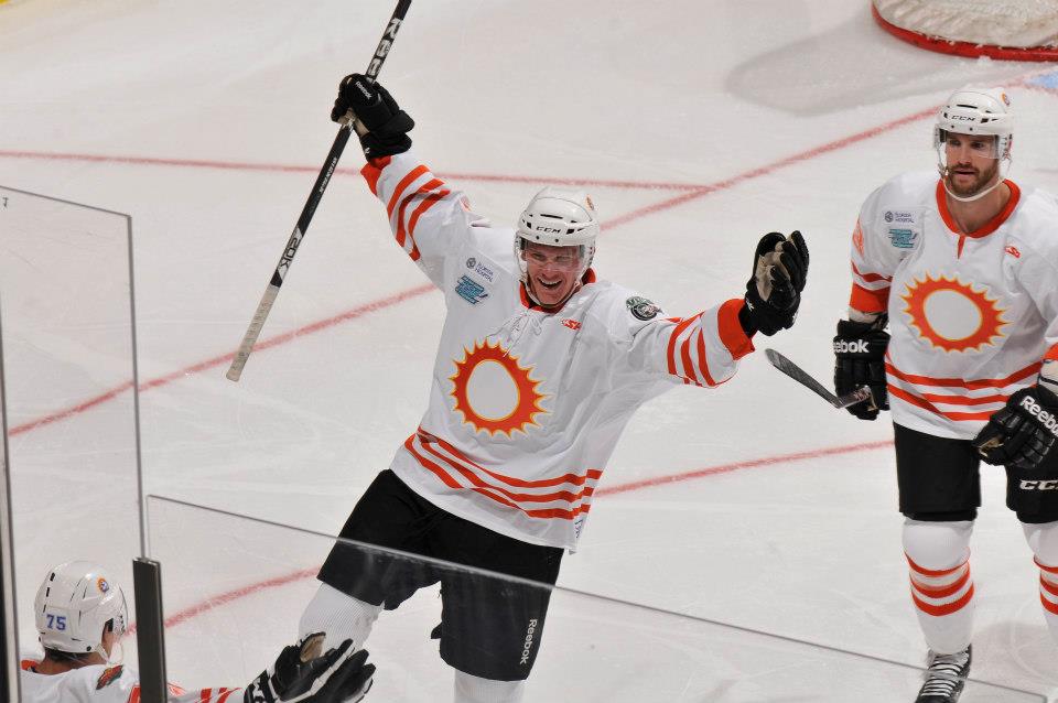
4) Orlando Solar Bears – For my money, their third jersey is the best jersey in the ECHL.
3) Bakersfield Condors – Trend-setting. You’re welcome, USA Hockey. (you already know)
2) Gwinnett Gladiators – Ditch the maroon thirds, stick with the black and whites. Like the logo, the colors, and the design. (click here)
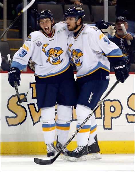
1) Toledo Walleye – These jerseys pop on the ice. The color scheme is awesome, they have three different and distinct jerseys, and all work in their own way. Well done.
This is sure to cause controversy and debate. Fire your tweets at me where I messed up. Until next time Condorstown…
Ryan Holt a.k.a. Holty, is the voice of the Condors and recently wrapped up year two in Condorstown. Have a #HoltysBlog idea? Follow him on Twitter @BroadcastHolt or shoot him an email with ideas to rholt@bakersfieldcondors.com