Ugly Sweaters, Invisible Bartl (Holty’s Blog)
So I walked into the office this morning and this first thing Invisible Kevin Bartl (@KevinBartl) told me to do with myself was write a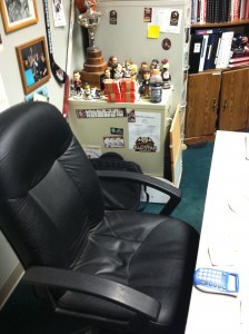 blog. I told him I had a lot going on, but he said the people of #Condorstown deserve a blog and that they missed last week’s edition of #HoltysBlog. I took a picture of the angry look he had on his face as he scowled at me. It’s on the right.
It may be my blog and I’ll do what I want, but when Invisible Kevin Bartl speaks, Clint Eastwood interprets, and I do as I’m told.
My blog today will be on hockey sweaters. In case you haven’t seen (don’t tell them either), we’re gaining on those guys from Stockton on Twitter. If we pass them it will be nice, but won’t reveal our BRAND NEW jersey this season. To do that, we need your help big time on Facebook. Get all of your friends to like us (click here and then click like). Share the page with your friends. Do whatever you can. Please. We’ll have an incentive for you to do so next week.
Now for the blog…
I’m going to give you what I think are the FIVE WORST NHL hockey sweaters of all time. Most want to know the five best, but worst is much more fun. I will quantify this by saying, I’m no expert. There are hundreds of sweaters out there. I limit to the NHL, because there are too many bad minor league jerseys out there and I will quantify this by saying that it has to have been worn by a team for an extended period of time. No one-hit wonders here. They’re in order leading up to the worst in history.
#5 Boston Bruins (Mid-Late ‘90s) Yellow just doesn’t work for hockey as a primary color. I don’t know why or how, but something about it just isn’t soothing to the eye.This was a third jersey that NHL greats Ray Bourque and Cam Neely had to wear. This was also the period of time when a young Holty started really getting into the game. I can safely say my parents never purchased this jersey for me nor did I ever want them to give it to me for my birthday. In fact, I only own one Bruins jersey. It’s a black “Holt 77” sweater and is mounted in my house with a picture of Bourque signing it when I was a kid. Love the B’s. Hate this jersey.
#4 Nashville Predators (Early 2000’s) If yellow doesn’t work for a sweater, then certainly mustard yellow isn’t going to work. This jersey is terrible. In some weird way, itmakes me long for their current bright yellow ones. Wait, you know what other team wears dumb looking bright yellow jersey? Oh yeah, Stockton. I knew there was a reason I didn’t like the color yellow.
#3 Phoenix Coyotes (Early 2000’s)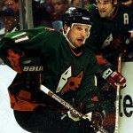
What is going on with this alternate jersey? How many colors can you possibly fit on one jersey? Phoenix has a black one that they wear currently with a dog-looking coyote on the front that is just as bad, but this one takes the cake.
#2 Dallas Stars (Early 2000’s)
Dallas, for a relative new city/organization, has a tremendous history of success and some star players. Unfortunately, they had to wear this monstrosity of a jersey. Are they secretly the Bulls and nobody told anyone? This would be the worst of all-time except there is no denying the worst.
#1 Vancouver Canucks (Late 1970’s-Early ‘80s)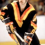
The Canucks since 1970 but have, in those 40 years, changed from royal blue/green to these sweaters, then changed their logo, but kept the black/brown/orange/yellow color scheme, then switched to a navy blue and red and changed the logo, and then landed back on royal blue and green again, but used the updated logo. You follow? These are the worst of the bunch though without question. Vancouver is used to rioting. They should burn these things in the process.
Did I get it right? What do you think?
Until next Thursday #Condorstown …
Have an idea for #HoltysBlog? Tweet him @BroadcastHolt or e-mail rholt@bakersfieldcondors.com
Ryan Holt a.k.a. ‘Holty,’ is the younger half of the Condors broadcast duo, and recently completed his first season in #Condorstown. The season is upon us. Follow him on Twitter @BroadcastHolt for random stuff confined to 140 characters.


